The Ultimate guide to Journaling with Chartlog
Find your way around Chartlog
Now that we have imported our first trades, let’s discover Chartlog together. We’ll go through the main tabs one by one: Dashboard, Trades, Strategies, and Insights.

Dashboard
First, we go to our Dashboard. The Dashboard shows you the most important overall stats for the current month. For each trading day, profits and losses are shown in a bar chart. We can also see our win rate, profit factor, number of trades taken, and the quantity of shares/contracts/lots we traded. Further down, recent trading days and key figures are shown. In the upper right corner, you can see a calendar with green or red dots below the dates indicating whether you made or lost money. Use the Dashboard as a starting point to get an overview before diving deeper!
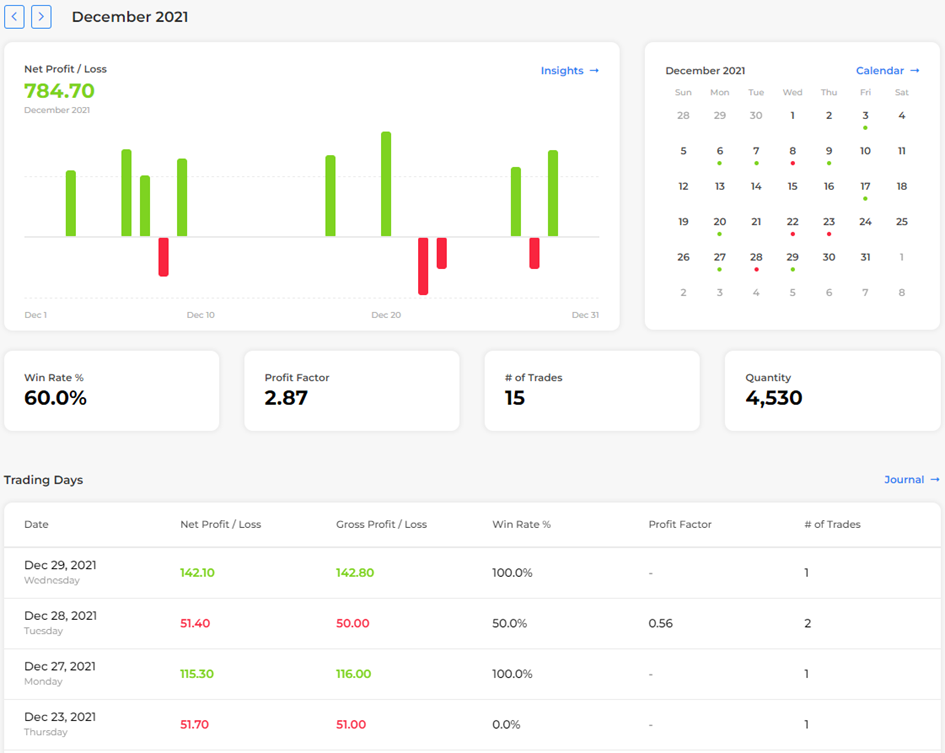
The trades in our example set happened in December 2021 and January 2022. You can switch the month in the top left corner. Let’s check December’s results together! As you can see, we made 784.7 USD with 8 green and 4 red days. Our win rate was 60%, our profit factor 2.87, we took 15 trades, and traded a grand total of 4530 shares. Below that, you can see the last few trading days in December with their respective performance data. Looks like we had a great December! If you switch to January, you can see that the year 2022 started a bit slower with only 201.75USD in profits and our win rate dropped to 50%. We also took fewer trades and traded on fewer days.
Trades
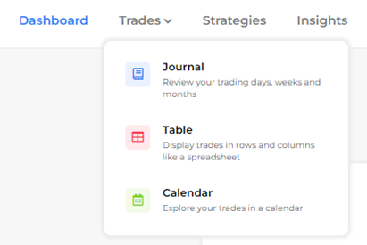
Next, we want to check out the trades we imported. Go to the Trades tab and choose between the Journal, Table, and Calendar view.
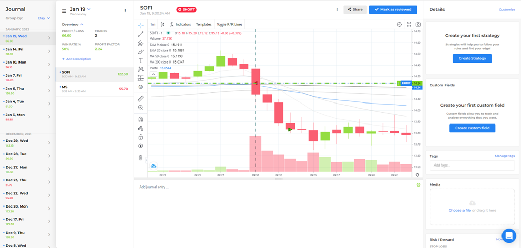
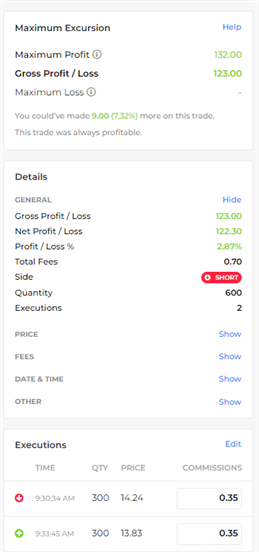
In the Journal view, you'll see the last few trading days with their P/L numbers on the far left and a summary of the most recent day including the individual trades and the most important daily metrics. When you select a specific trade, all trade executions will be shown in an interactive chart. Feel free to customize the chart design (and save it as a template), add indicators, text, or any kind of drawing. Below the chart is the description section where you can add written notes, insert images, create bullet lists etc. This process can also be simplified and sped up by using templates. On the right, the Details section displays everything you need to know about the selected trade. The sheer number of fields and the amount of data here can look a bit overwhelming in the beginning, but here’s a quick breakdown:
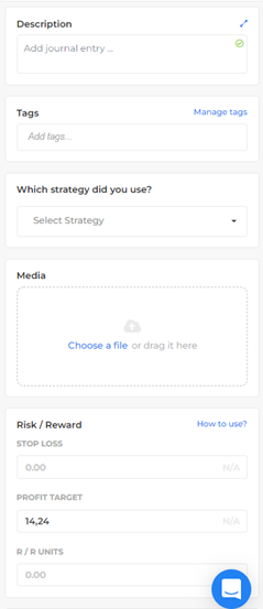
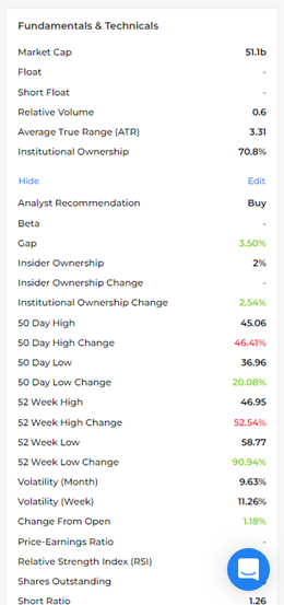
Basically, there are two kinds of fields. First, there is data that is automatically imported or calculated by Chartlog. You will find details regarding the trade such as the P/L before and after fees, the quantity traded, your executions, fundamentals & technicals, and maximum excursion data. Second, there are fields that you can fill in yourself. Most importantly, you’ll assign strategies to the trades. You can also add tags, define stop losses and targets (Chartlog calculates R/R ratios for you), upload additional media files, and create your own personal custom fields. Scroll up and down through the details section to see the fields available. For this course, we will focus on Strategies and Custom Fields to get you started!
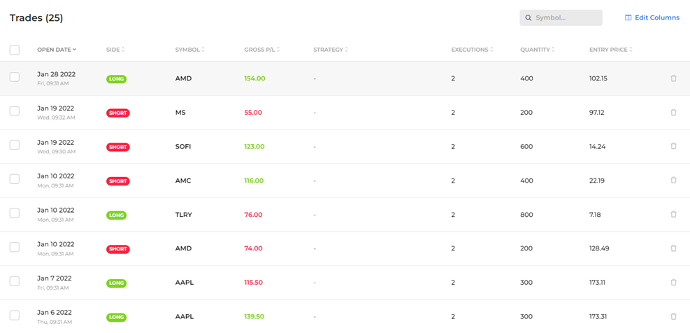
The Table view resembles a spread sheet displaying trades in rows and columns. Customize the table, sort or filter by various criteria, and check out open trades. You can also take bulk actions such as deleting more than one trade at the same time.
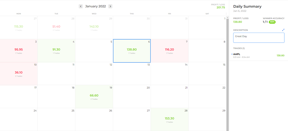
The Calendar view shows the P/L and number of trades for each trading day in the current month as a calendar. Check a day’s trades and metrics on the right-hand side and change the month at the top. Here, we selected Thursday, January 6th, and we can see that we made 138.8 USD that day with a single trade on AAPL. We can also add a description for the day, let’s keep it simple and just call it a “Great Day”!
Next Chapter